

Table of contents
Hey, I'm good and hope you are doing well😊. Watching CSS art(codepens) is fun so why not create one. Let's get hands-on and create one using box-shadow ✨
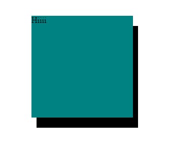
The box-shadow property adds shadow effects around an element's frame. It has 6 values in total:
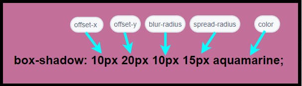
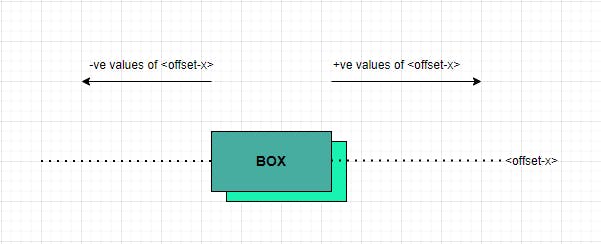
<offset-x>
This value specifies the horizontal distance of the shadow from the box.
Positive(+ve) values place the shadow on the right & Negative(-ve) values place the shadow on the left.
<offset-y>
This value specifies the vertical distance of the shadow from the box.
Positive(+ve) values place the shadow down and negative(-ve) values place it upwards.

For example:
HTML code(common for all examples):
<body>
    <div class="box">Hiiii</div>
</body>
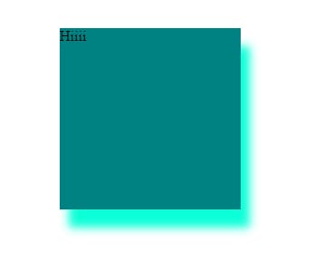
.box {
  background-color: teal;
  width: 200px;
  height: 200px;
  margin: 10vh auto;
  /* offset-x | offset-y | color */
  box-shadow: 10px 20px aquamarine;
}

Note: If both the <offset-x> and <offset-y> is set to zero then the shadow is cast exactly behind the box element or we can simply say that box overlaps the shadow.
<blur-radius>
The value specified to this applies a blur effect to the shadow. It cannot have negative values. The minimum value is zero. It is also the default value. As we specify higher values blurring effect magnifies.
.box {
  background-color: teal;
  width: 200px;
  height: 200px;
  margin: 10vh auto;
  /* offset-x | offset-y | blur-radius | color */
  box-shadow: 10px 20px 10px aquamarine;
}
<spread-radius>
The shadow cast by an element(box) is of the same size as the element by default. However, we can change its size by specifying <spread-radius>.
.box {
  background-color: teal;
  width: 200px;
  height: 200px;
  margin: 10vh auto;
  /* offset-x | offset-y | blur-radius | spread-radius | color */
  box-shadow: 10px 20px 10px 15px aquamarine;
}

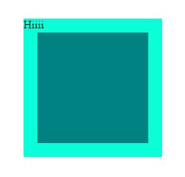
<inset>
By default, the box is above the specified shadow but if <inset> is set then the shadow is cast inside the frame.
For example:
.box {
  background-color: teal;
  width: 200px;
  height: 200px;
  margin: 10vh auto;
  /* inset keyword | offset-x | offset-y | blur-radius | sprea-radius | color */
  box-shadow: inset 0px 0px 0px 20px aquamarine;
}
<color>
Here, color of the shadow is specified. If not specified then it takes the currentcolor which is the current color of the text present in that box.
.box {
  background-color: teal;
  width: 200px;
  height: 200px;
  margin: 10vh auto;
  /* offset-x | offset-y | color */
  box-shadow: 10px 20px;
}
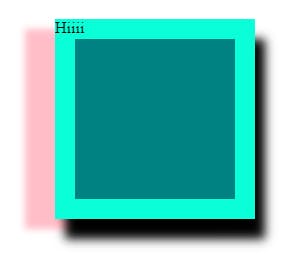
A box can have multiple shadows by entering values separated by commas(,).
For example:
.box {
  background-color: teal;
  width: 200px;
  height: 200px;
  margin: 10vh auto;
  /* inset | offset-x | offset-y |blur-radius | spread-radius | color */
box-shadow: inset 0px 0px 0px 20px  aquamarine, 10px 20px 10px, -30px 10px 7px pink;
}
Let me know what you like and dislike about my blog. Do use this simple CSS property in your projects. Stay tuned for more such blogs. Have a good day:)